Early Warning System for COVID-19
HealthWeather
Helping a health technology company turn real-time illness data into a trusted public health alert system
All design assets on this page (including visual language, wireframes, and high-fidelity mockups) represent my own work: always created in collaboration, but executed by me.
At Kinsa, the data science team was refining outbreak-detection models in real time.
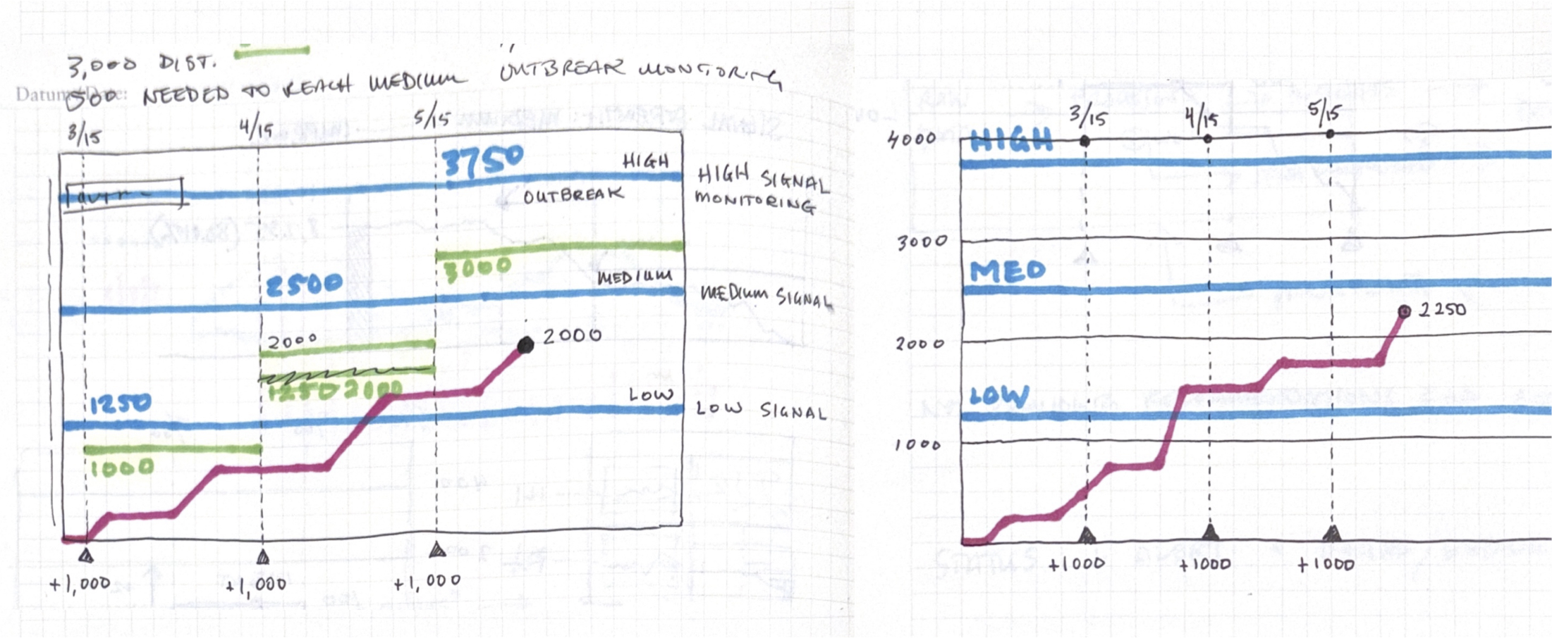
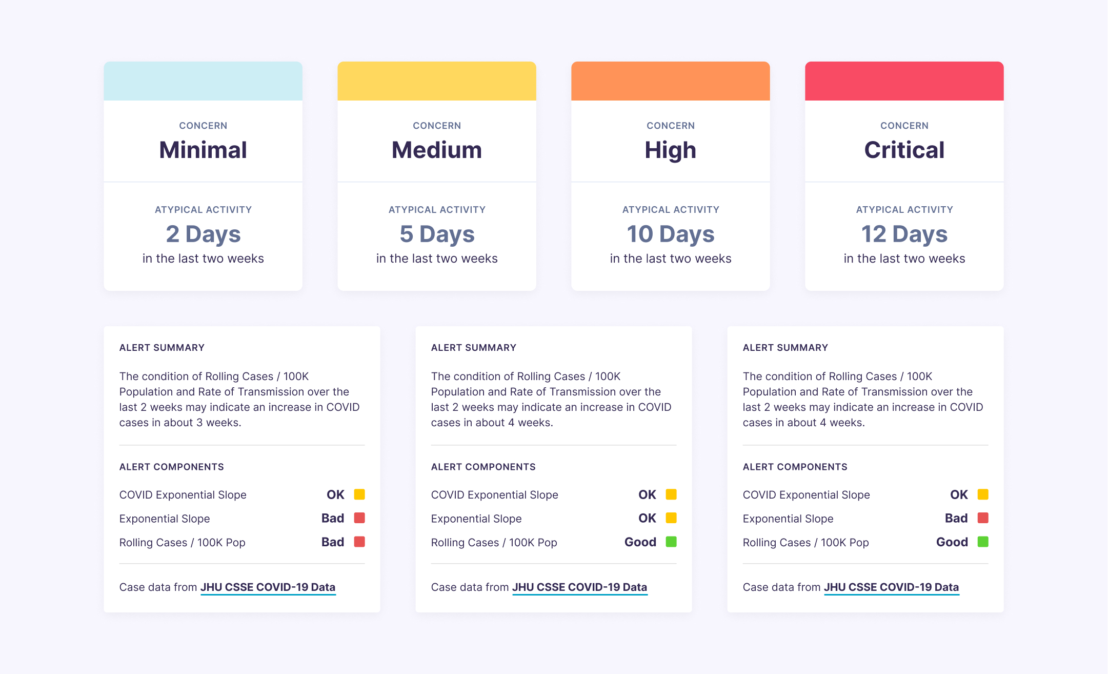
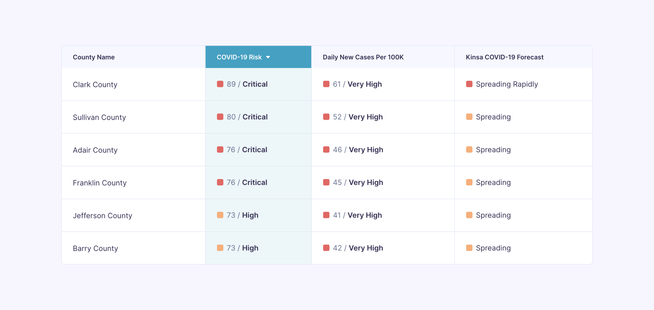
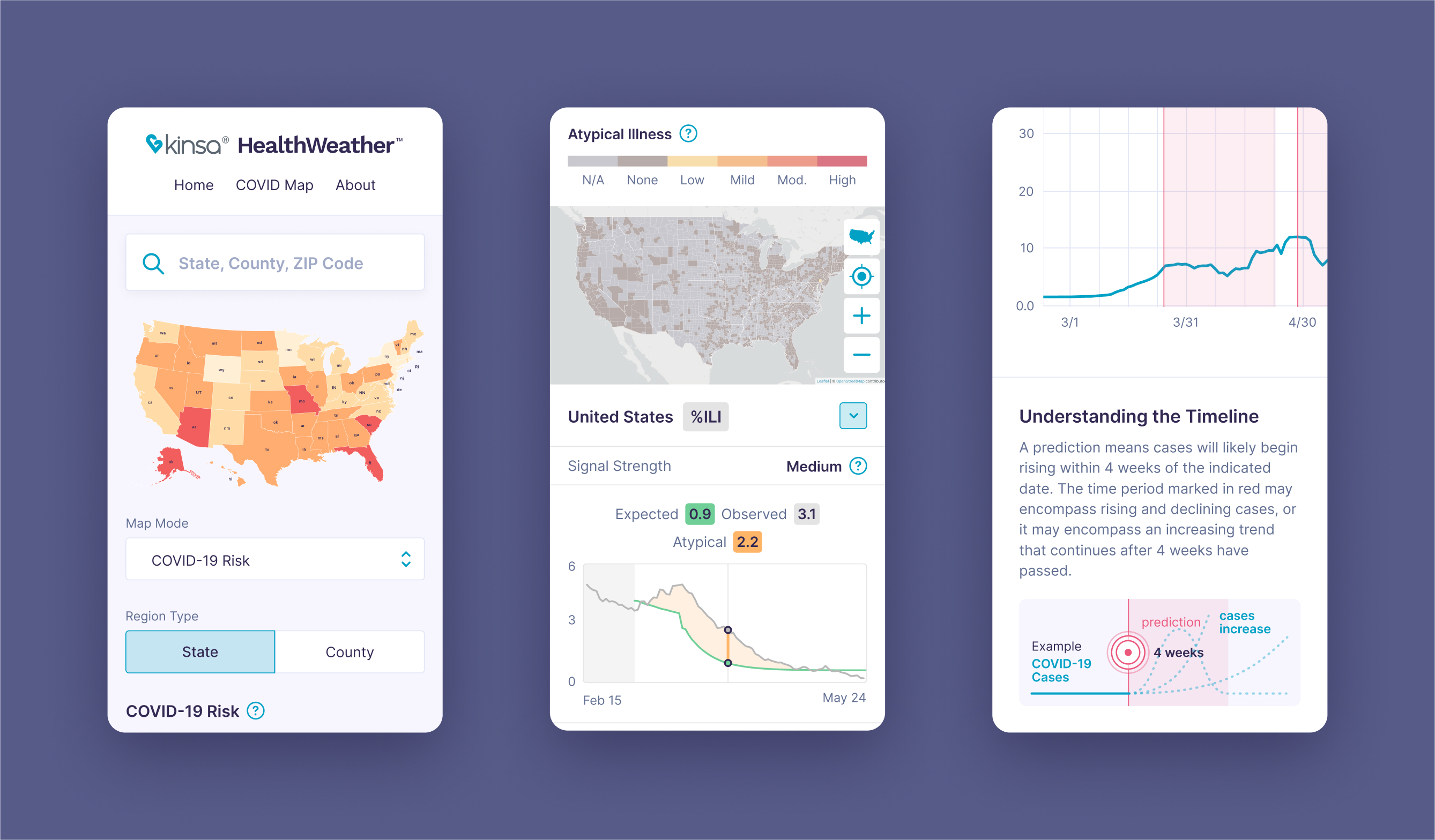
My role was to interpret those evolving signals and turn them into confident, accessible user experiences. This meant working side-by-side with data science, engineering, and product leadership to define what an “alert” meant and how certainty should be communicated. The work was as much about shaping the logic and language around risk as it was about designing screens.

COVID-19 was a trust-sensitive environment where accuracy, tone, and timing shaped user confidence.
I designed alert patterns that balanced clarity with uncertainty. Through iterative testing, I learned that simplicity and calm presentation often built more trust than exhaustive detail. That experience informs how I think about alert fatigue, user stress, confidence cues, and layered access to information.

HealthWeather moved quickly, and I operated as the primary designer for the initiative.
I established the visual language, components, and interaction approach while coordinating with a distributed set of stakeholders. The pace required thoughtful structure and flexibility. I made decisions that both needed to work immediately and scale into future needs as models matured and user expectations evolved. The result was a resilient design foundation that supported rapid iteration.

Lessons & Outcomes
This project was a turning point for my career in that it solidified my interest in data visualization embedded in product design.
- Built real traction: Led design with a PM partner and helped turn HealthWeather into a true destination: 2M+ users in 9 months, 39% avg MoM traffic growth, doubled time on site, and cut bounce rate by more than half.
- Refined the definition of trust: Learned that credibility isn’t just data transparency. Clarity, emotional tone, and confidence cues matter as much as methodology.
- Sequenced value: Discovered the importance of leading with clear utility before novelty or narrative depth; timing and layering information are critical in high-risk contexts.