Data Visualization & UX Strategy
Axiom
Helping a financial product company embrace visualization in decision-focused data experiences

About The Role
Over time, I helped shape a long-term data visualization strategy at Syntellis. I created documentation, patterns, and collaborative workflows that expanded design’s role from report production to strategic partnership in product development.
:
Syntellis makes a strategic planning platform for hospitals, universities, and financial institutions.
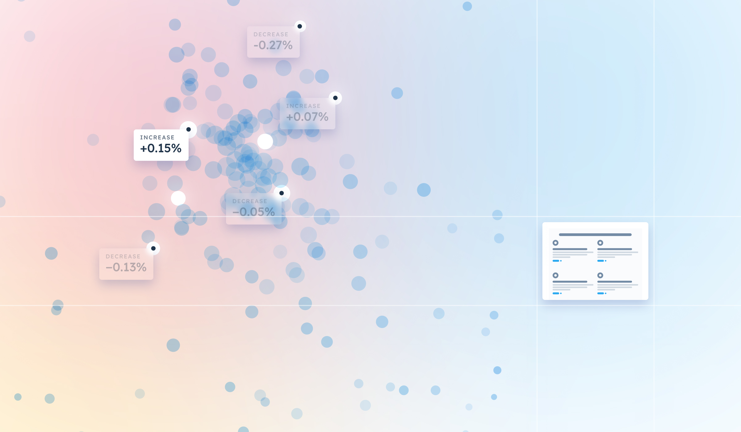
Syntellis Performance Solutions is the company behind Axiom, a software platform that helps large organizations manage their financial futures through forecasting, budgeting, and analysis. While Syntellis maintained a valuable dataset describing the financial decisions of thousands of institutions, the meaning of that data wasn’t always easily accessible through the core product experience.


:
The organization was ready to treat data visualization as a core UX capability, but needed guidance to fully realize that vision in practice.
At the time, data visualizations in Axiom were accessible primarily through external reporting tools. These tools created distance between the data and the moments where decisions were being made. Because the visualization engines were third-party products, they also couldn't evolve to meet Syntellis clients' unique needs.
As the company reimagined its UX practice, I was brought in as a specialist to help explore how visualization could be embedded as a thoughtful, iterative part of the product experience.
:
I helped elevate data visualization from a reporting task to a strategic, technically-integrated function within product design.
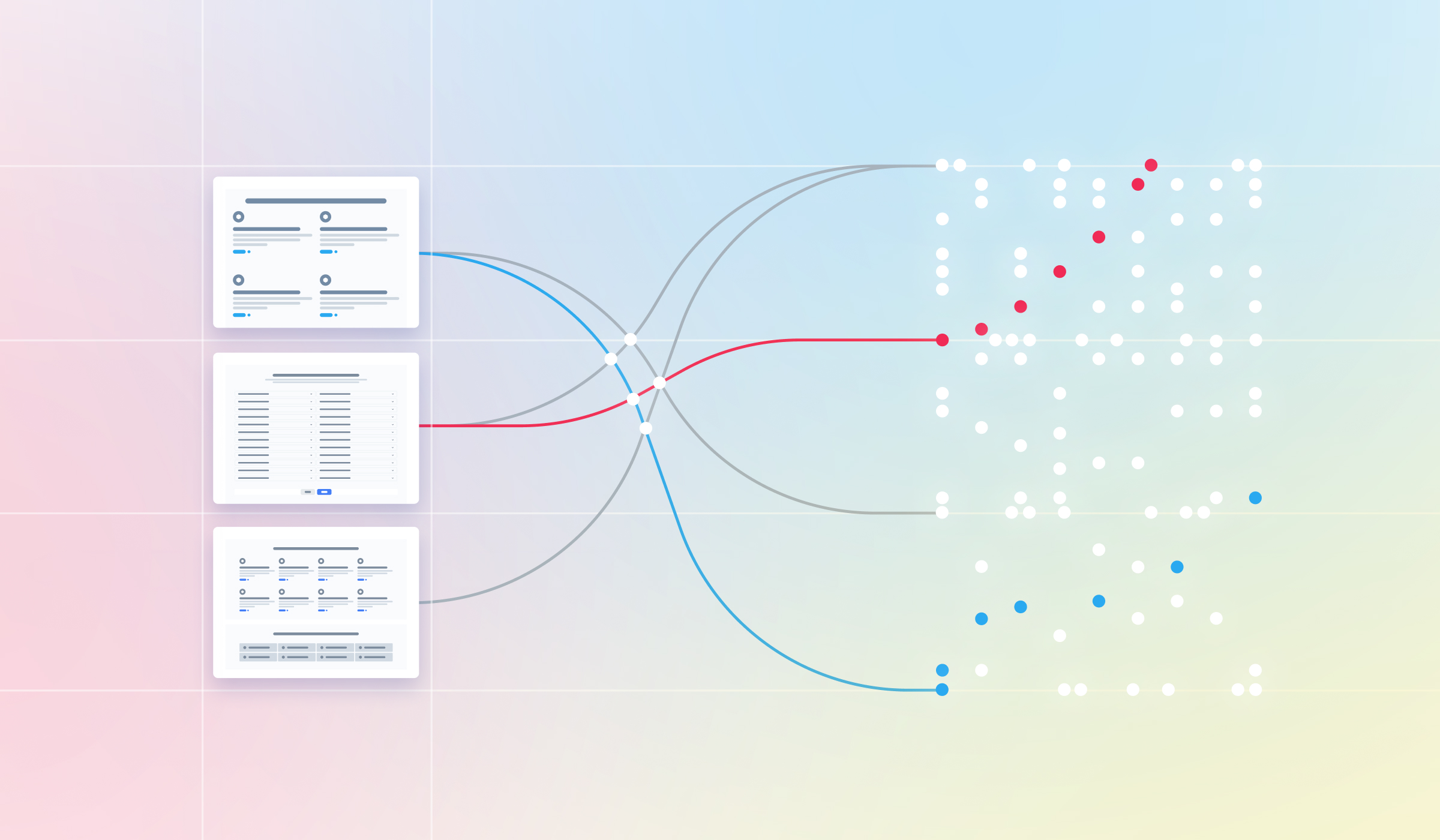
Early on, I created a visual language and best practices for charts. Over time, I led concept validation efforts, partnered with engineers to define technical feasibility, and co-developed new planning experiences that embedded data more natively. I also synthesized patterns across products to form a reusable ecosystem of design solutions, helping cross-functional teams align on how data should feel and function across the platform.
A core part of the opportunity was reframing how data was understood by designers, engineers, and product managers. I advocated for simple, timely, comprehension-focused visualizations rooted in real user context rather than static dashboards.
I also built strong relationships with engineering, treating implementation challenges as shared learning opportunities. I used visual explanations and team discussions to bring what I’d learned back to the UX team and help translate that knowledge into clearer interface decisions. By bridging this gap, I helped product and design leads integrate engineering feedback as valuable input for stronger strategy while reducing friction.
:
My work helped build a reputation for data design within the organization as the connective tissue between data, design, and engineering.
I helped demystify data visualization as a user-centered, technically grounded design discipline. In doing so, I also supported a broader evolution within UX: one where curiosity, technical empathy, and internal education became just as critical as interface craft.
By reframing data as something embedded, contextual, and conversational, I helped product teams move beyond dashboards and toward tools that genuinely supported users’ decision-making goals. This shift led to earlier design involvement, stronger collaboration across departments, and a more integrated view of what the product could become.
Over two years, I led early-stage concepts for new visualizations, collaborated with engineering on workflow-integrated charts, and guided product leaders toward more strategic uses of the company’s data. I helped shape experiences across verticals that made data feel less like a report and more like a trusted companion in the planning process.