Visual Brand & Interactive Design for Environmental Data
Aclima
Helping an environmental technology company turn novel air quality data into an accessible, narrative-driven public report

About The Role
With a limited scope and timeline, I centered my work on defining and applying a strong visual brand to an existing prototype. I adapted by translating client feedback into rapid style iterations that balanced aesthetics with usability.
:
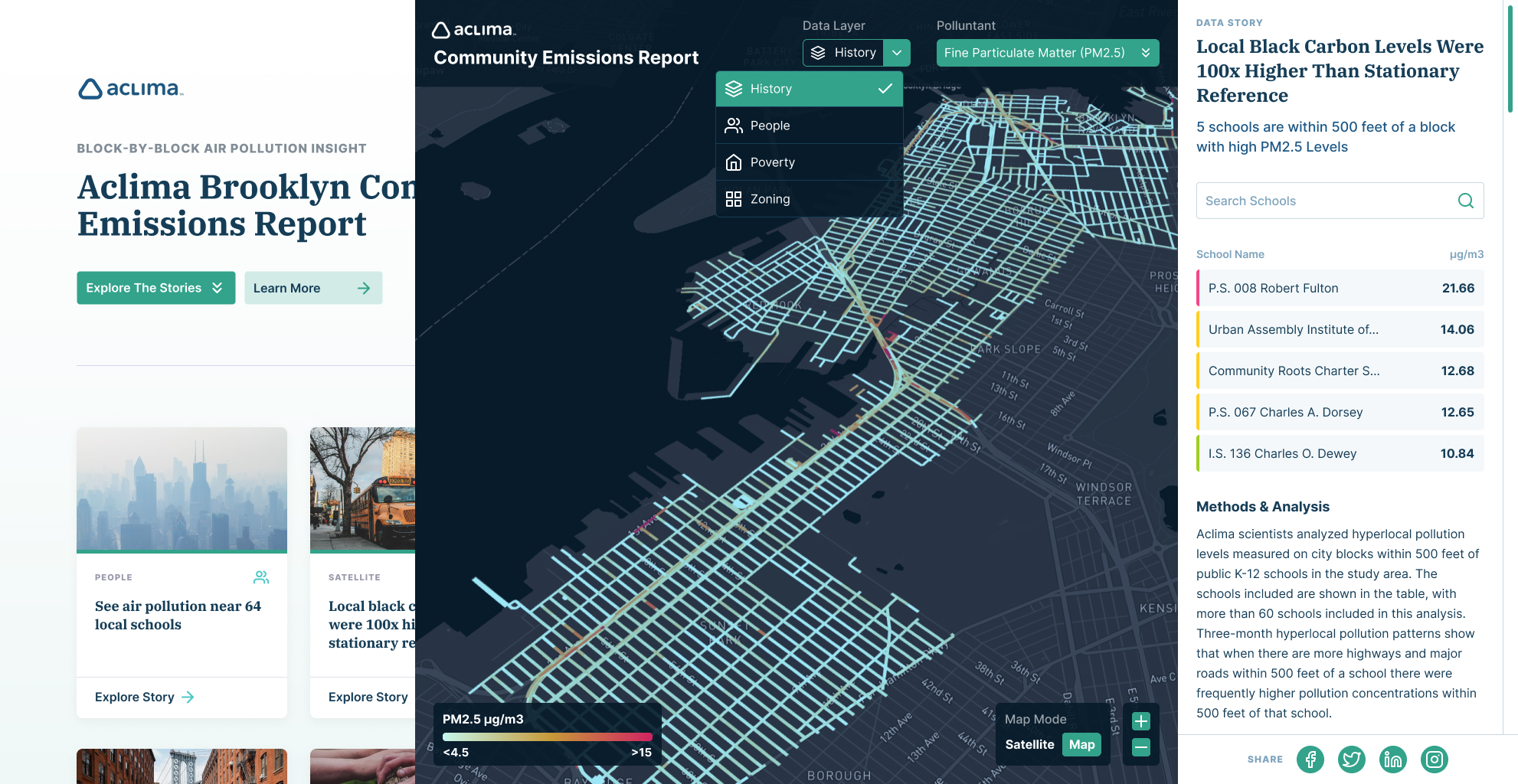
Aclima creates hyper-local air quality datasets using sensors mounted on vehicles to reveal pollution patterns that traditional monitoring often misses.
At this moment, Aclima was expanding how it communicated its work, seeking to demonstrate the value of its data not only to researchers but also to policymakers, journalists, and the communities most affected by pollution. This was a pivotal stage in positioning Aclima as a trusted voice in environmental justice and public health.

:
Aclima and Porpoise Studio sought to turn a proof-of-concept prototype into an interactive report that told a clear, human-centered story.
The shift was about more than presenting maps and numbers. They needed a visual brand and interface system that could tell human-centered stories with technical credibility, creating a narrative that tied community experience to scientific evidence. What was still unclear was how to balance accessibility with rigor, and how to move quickly while developing a design language from scratch.

:
I led visual design to define the brand and apply it across the interactive report.
Working with Aclima leadership and Porpoise Studio’s engineers, I curated visual directions, tested them against real UI screens, and applied stakeholder feedback to refine typography, color, and hierarchy. I also produced responsive layouts for multiple devices and contributed information architecture diagrams to ensure menus and story content stayed aligned. My role was to create cohesion across moving parts so that design decisions could be made rapidly without losing clarity.

:
The collaboration brought a new brand aesthetic and interactive report to life.
The finished work demonstrated how quickly design alignment can spark meaningful progress. It provided Aclima with a credible, engaging way to showcase their data, which was later featured in The Washington Post for revealing the disproportionate pollution burden borne by communities of color. More than a visual refresh, the project showed how focused design can transform technical work into public awareness and advance urgent conversations about equity and the environment.